Working with tonal underpaintings

A personal journey of discovery

Starting Out...
When I first started out with oil paints, I was like a child in a sweet shop, keen to experiment with all manner of styles and genres. Having had no formal training in the craft of painting, I had a broad notion that oils would allow an artist to build up a painting in several layers and that there was a golden rule of 'fat over lean'. But for want of a teacher, or any particular method to follow, I would typically launch straight into a full colour 'underpainting', where at least 70% of the tone and colour work would be done in one sitting. After this I would work on some finer detail and refinements in maybe one or two 'fatter' sittings before considering the work finished.

In an attempt to honour the 'fat over lean' rule, I would usually start out with slightly thinned paint for stage one, then raw tubed paint for stage two, and finally adding a little extra linseed oil for any further work. My favoured style at the time was highly coloured and probably leaning closer to pop art than anything else, as can be seen in these examples...


Learning from the past...
Working like this was a lot of fun, but something was niggling at me. Having a deep admiration for the painters of the Flemish and Italian Renaissance, I was continuously wondering how they did it. What materials did they use? What techniques had they employed to produce work so different from mine? How come nobody was teaching this any more at art schools?


I could glean a certain amount online and from books, but it wasn't until I made contact with a teacher called David Cranswick that I was able to get some proper hands-on training in glazing and underpaintings. David had spent many years researching the practical techniques of the old masters and was now offering studio training to interested students. It was at this stage that I learned (among other things) how to start with a tonal monochrome underpainting, typically using burnt umber or other earth tones.


Below are a couple of old master studies completed as exercises during this time, both based on paintings at the National Gallery in London.

Study after Willem Kalf (oils)
Having been set this daunting exercise by David, the images below show a simplified version of how the painting was built up in stages, using a traditional gesso panel. (For more detailed step-by-step images with descriptions of what was happening at each stage, visit the master copies page).


Study after Verocchio (Egg Tempera)
This exercise was my first experiment with egg tempera, using pigments mixed to a yellowish 'verdacchio' for the underpainting. This taught me that the tonal underpainting method works as well for tempera as for oils. Below is a simplified version of the painting stages. (For more detailed step-by-step images with descriptions of what was happening at each stage, visit the master copies page).


Embracing the approach...
Having discovered the joy of tonal underpaintings, it is safe to say that this has become my staple approach. Unlike the master copies above, which start with a linear underdrawing, this method really comes into its own for me when working from life, where a loose 3-tone underpainting can be developed very quickly using a rub-back approach and then refined in the follow-on stages. In that respect, I feel that this method is very well suited to artists whose natural inclination is to work tonally, e.g. when drawing with charcoal, rather than those who favour a linear approach.

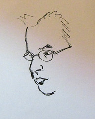
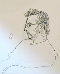
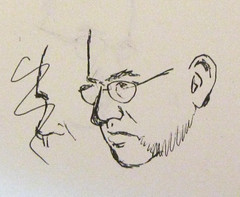
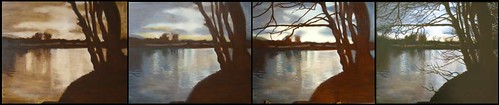
The examples below show a range of earth-based underpaintings in which I have used this method... some of which have been taken through to finished paintings. All of these use either burnt umber, burnt sienna or raw umber as the base tone. (visit my landscape and still life pages if you wish to see more detailed step-by-step images of any of these pieces)


Warm VS Cool...
A variation on earth-based underpaintings is the grisaille approach, which is Usually an opaque underpainting in a neutral grey, which can look like a black and white photograph if taken to a highly realist degree. An undisputed master of the grisaille underpainting was Ingres...


Something to aspire to indeed! I have not yet tried my hand at such a photographic grisaille, but below are a few experiments where I have adapted my slightly looser underpainting approach to use a cool, neutral grey, rather than a warm earth tone. So far I have to confess that I have not found any great benefit in replacing earth hues with a neutral grey. I think it essentially comes down to deciding whether each finished work is likely to benefit more from a warm or a cool underpainting.


Other underpainting approaches...
It is worth mentioning that in my experiments above, I have only skimmed the surface of the range of underpainting methods out there. Other key approaches to look into would include:

  • the traditional 'verdacchio' (green) approach used for skin tones in early renaissance works
  • the 19th century dead colour approach taught in many of today's 'atelier' schools
  • the detailed underdrawings on panel, employed by early Flemish painters such as van Eyck
  • the pros and cons of differing toned grounds

I am also continuously inspired by viewing the approaches of other living artists. Below is a link to a detailed grisaille technique that the portrait painter, Scott Bartner employs. I would like to try this technique for myself in time.


Some Old Master Underpaintings (for inspiration)


Resources for learning more about underpaintings...


My Camera Lucida

For anyone not already aware, the camera lucida is a visual aid that enables an artist to 'view' both the subject and the paper at the same time. When used accurately, the subject will be superimposed as a ghostly, transparent image directly over the paper - and can therefore be traced.

Sounds great? Well, the downside is that they are (in my view) devilishly difficult to use! Here are some pictures of mine (it is a vintage specimen by Leon, from the early 20th century):


So how does it work?

In a nutshell, the traditional camera lucida works by enabling the artist to position his/her eye above a little prism that effectively splits the pupil into two, so that, although the eye is looking down at the paper below, one part of the eye is actually seeing the subject ahead superimposed onto the paper. Lenses are used when there is a need to focus, e.g. if there is a difference between the distance of the subject and the distance of the paper.


Although the camera lucida was patented by William Wollaston in 1806, there is some debate as to whether it was actually invented centuries earlier. It also experienced a resurgence of popularity in the early 20th century.

More details can be found in these articles...


My Experience...

From my limited experiments, I would say that speed is of the utmost importance if you want to get the best out of your camera lucida. Once you have positioned your eye (and your subject) in the correct spot, you really must not move your head a millimetre, and your subject needs to stay absolutely still. The smallest movement can lead to a strange distorted effect when you pull your eye away and look at what you've achieved on paper.

The experimental sketches below illustrate this... each one took between 30 seconds and a minute, and of these, only one of the head studies is an accurate portrayal of the subject, with everything in the right place. The wine bottle fared better due to being a little better behaved! I suspect user error probably had a lot to do with it - I need to practice, though I doubt this will ever become a mainstream part of my drawing technique.


I have not yet tried out my camera lucida on a large plein air scene, but I fully intend to, as I believe this is one of the best ways to use it - to get the broad shapes and perspective lines in place, before switching to some old-fashioned 'eyeballing'.


Why the resurgence of interest?


In 2001, the British painter David Hockney caused a stir when he published this book, in collaboration with scientist Charles Falco...


In the book, Hockney put forward a hypothesis that many of the old masters had used various optical aids from an earlier date, and to a greater extent, than is currently believed. Among the various optical aids covered in Hockney's book is the camera lucida.

His theory triggered a fair amount of uproar from many art historians, with some of the most extreme responses found here:

Certainly, there have been some strong counter arguments made. In 2006, I attended a lecture at the National Gallery in London, entitled: "Did The Great Masters 'Cheat' using Optics? The Mysterious Rise in Naturalism in Renaissance Painting". The lecture was a direct public response to Hockney's theories by David G. Stork (Chief Scientist of Ricoh Innovations). If you missed the lecture, a paper by Stork on this topic can be seen here:

Whatever your take on the matter, I find this topic fascinating and Hockney's book is well worth reading as a feast for the eyes if nothing else. It is certainly thanks to Hockney that my interest in the camera lucida was aroused - and presumably that of countless others.

I suspect this has also led to a significant increase in their value on the antiques market... see here for a site that specialises in antique camera lucidas:

Modern Camera Lucidas

Various companies are now producing modern camera lucidas, which appear to offer a variation on the traditional prism approach, using instead a half-silvered mirror tilted at 45 degrees. I have not seen one of these in the flesh, but examples can be purchased from these vendors...


Painting on Copper

From my limited exerience, I have found copper to be a beautiful surface to work on. My personal choice so far has been to use copper etching plates at 1.6 mmm gauge from Lawrence Art Supplies. Given that they are pretty heavy, the size should be kept fairly small - (I have gone no bigger than 12 inches).

When preparing the copper panel, the first decision to make is whether or not to prime it with gesso. It seems to me it depends on why you are using copper in the first place. If it is purely to provide a solid, reliable surface then you may want to go ahead and use gesso. But my personal choice is to keep the panel un-primed, in an attempt to somehow harness that warm glowing colour in the underpainting, and maybe even let a little of the copper show through in places.

Below is an outline of my first experience in preparing a sheet of copper.

Here is a picture of the panel as it came - a beautiful shiny thing indeed!


However, advice from more seasoned artists than I indicated that this would need to be sanded in order to hold paint with any degree of reliability. So I introduced some tooth by sanding the panel with 60 grit paper.

Here is a picture of the panel after sanding... it now has a pinkish hue, and thankfully still glows, even if it is less shiny.


At this stage it is ready to go, and this is where I started work on a small still life of a muller and a glass bottle. For step-by-step images of the painting, cick here: Still Life with Muller


W.F. Martin's Glazing Mediums

Some time ago I read an online article entitled 'Glazing with Oils' by William Martin at wetcanvas.com. In this article he demonstrates the stages of a highly realistic still life painting, using 3 separate glaze mediums at different stages. I was inspired enough to want to try out these glaze mediums for myself (see 'Still Life with Aubergine' and 'Still Life with Books'). Here are my initial findings.


'Lean' Medium: this is the first of the 3-stage medium recipes, and is made up as follows:


  • 5 parts Turpentine (or Oil of Spike)

  • 1 part Damar Varnish (or Venice Turpentine)

  • 1 part Stand Oil


I have used this for underpaintings by mixing a little bit of medium in with each brush-load of paint. In some cases I may not have used quite enough, as the underpainting was not quite dry the following day (possibly due to using flake white ground in slow-drying poppy oil). But general I have no complaints with this medium.


'Medium' Medium (I know that doesn't sound right!) This is the second glaze recipe and is made up as follows:


  • 2 parts Turpentine (or Oil of Spike)

  • 2 parts Damar Varnish (or Venice Turpentine)

  • 1 part Linseed Oil


Personally I chose to use spike oil and venice turpentine for my mixture, and the result is a beautiful-smelling medium! With this medium I reverted to my preferred method of applying the mixture thinly to the canvas/panel and painting into it with neat paint. I can say that of all mediums that I have used, this one is the most joyous to paint with. The paint flows so smoothly, and the surface is reliably dry by the following day, as long as the paint is not applied too thickly over the medium.


'Fat' Medium: this is the final glaze recipe, only to be used for the topost layer(s) of the painting. It is made up of:


  • 2 parts Turpentine (or Oil of Spike)

  • 1 part Damar Varnish (or Venice Turpentine)

  • 2 parts Sun Thickened Linseed Oil


Again, I chose to use spike oil and venice turpentine, resulting in a wonderful smell. So far I have only used this on my Still Life with Aubergine painting. I rubbed this medium thinly into the canvas with the palm of my hand, and then painted into it with neat paint. I enjoyed the flow of paint and the surface was fully dry after a couple of days.


So, to summarise, I think it is fair to say that these are very enjoyable mediums to use, and most suited to THIN layers of painting where visible brush strokes are not required. One thing I have noticed is that my finished aubergine painting lacks glossiness, and will need to be varnished.


Lefranc and Bourgeois 'Flemish' Mediums

As a gift, I received two glazing mediums by Lefranc and Bourgeois... tantalisingly entitled 'Flemish medium' and 'Flemish Siccative Medium'. Having tried out these mediums on my 'Still Life with Apples' painting, here are my early conclusions...


'Flemish siccative medium' - this comes in a bottle and is made up of copal gum, linseed oil and rectified turpentine. The colour is a rich amber, and the medium flows rather nicely out of the bottle. Generally, it was easy to use and does dries within a few hours. On first use, I applied it to the surface of an underpainting and also mixed a tiny amount in with my paint. The trouble came when it appeared to lift my underpainting in places, but I confess that my underpainting may not have been 100% bone dry at the time. I will certainly try this medium again.

'Flemish Medium' - this comes in a tubs and is made up of Gum mastic, linseed oil, essence of spike and cobalt-zirconium siccative. The colour is a mid-amber and the consistency is a very thick gel, verging on gluey. It came out of the tube reluctantly and then needed a fair amount of squishing with a palette knife before becoming malleable enough to paint with.


The Woes...

More than the 'siccative' medium, I found the Flemish Medium very difficult to get to grips with. At first I was just not sure what to do with it... it was so thick and sticky that it could not sensibly be mixed with paint. So I thought I would stick to my usual method of applying a thin layer to canvas and painting into it with neat paint. Well that was easier said that done... getting this stuff applied thinly to anything, by hand or brush, is a challenge.


Eventually I resorted to the palette knife in order to spread a thin layer of the medium, like marmalade, over the surface of the canvas. Then I used a stiff 'brights' brush to scrub it into the surface as thinly and evenly as possible, rubbing with the heel of my hand where necessary. This done, I then had exactly the same trouble with the paint... it was a lot like painting into superglue! Again, I reverted to a flat 'brights' brush to scumble paint into the surface.


The Pros...

Now the interesting thing is that although none of this sounds like much fun... the resulting paintwork actually looked rather good. So I persevered with several layers in this way, and gradually found ways to apply paint more softly, even with a sable brush, over the gluey surface. So... to summarise. Despite the problems I had getting to grips with this medium, there are several benefits to it.


  • Firstly, the finished painting has a high gloss finish, that seems very resilient and won;t need varnishing.

  • Secondly, the colours appear bright and pure.

  • Thirdly, the paint layers all dried very fast - within 2 - 3 hours, so more than one layer can be achieved in a day.


I will certainly be trying out these mediums again. For more details:


David Cranswick's Glazing Medium ('Liquid Glass')

This is my most tried and trusted glazing medium to date, and the one used for most of my paintings in the last few years. It is known as 'liquid glass' and I have watched David Cranswick preparing it in a rather alchemical manner, using his secret recipe.

As can be seen in the photo below, the medium is a light golden colour and has a semi-transparent gel-like consistency. At the time of use, approx one part poppy oil is added to two parts of the medium, and (if desired) a couple of drops of dryer, such as cobalt siccative can be added to speed drying.


In use, the medium is best applied to the surface of the canvas or panel and then rubbed back by hand until it is barely there. Used in this way, it offers a smooth surface to paint into for the best part of a day without starting to drag, as long as too much siccative has not been added. It is generally dry enough to start painting the next layer the following morning.

One benefit of this medium is that it gives a nice level of translucency and gloss to each layer, without being overly shiny. It does not thin the paint causing brush strokes to disappear, so it is possible to be a little 'painterly' with it. Also, you do not need to varnish the finished painting, as the medium gives a varnish-like finish.

I would advise anybody wanting to know more about this medium to contact David Cranswick directly (http://www.davidcranswick.com/) or wait for his book to come out!  In the meantime, the medium is available for sale at Cornelissen & Sons of London.

Various examples of my work painted using this glazing medium can be found in the landscapes and still life pages. These pages include links to step-by-step images showing how the paintings were built up in layers.


Repairing a bent brush

Here is a little trick I learned recently and would like to share.


Having been very remiss with the care of one of my brushes, it turned up one day looking like this...


So I posted a question on the Cennini forum - asking whether there is any foolproof way to cure a brush whose bristles have got into this state.


In reply I learned this great tip. All it takes is to dip the brush in a pan of boiling water for a few seconds, and re-shape the bristles while they're wet. If you wish, you can wrap a piece of wire around the bristles, or tape folded cardboard around them as they dry, to ensure that they stay set in the desired position. I went with the wire option, and lo and behold - my brush came out as good as new!


First attempt at stretching a canvas

I confess, I usually buy my canvases ready-stretched, but having heard so many artists extol the financial and other virtues of stretching one's own, I felt that I really must learn this skill. Not least because I had recently experienced problems with a batch of ready-made canvases where the stretcher bars caused a visible crease to appear on the front of the canvases (a lesson learned about quality!)


Materials...
So first things first, I went onto ebay and found this canvas stretching kit....


I also bought a selection of rather nicely-made stretcher bars from the same company.


(For anyone interested, the ebay shop selling these things is here.... http://stores.ebay.co.uk/FRAMABLE)

Next came an internal debate about the pros and cons of different fabrics. There are many options out there.... linen, cotton, polyester.... heavyweight, mediumweight, lightweight... oil primed, acrylic primed, unprimed....
As it turned out, the decision for my first attempt was made for me by a very kind artist named Vincent Shaw-Morton (http://www.shaw-morton.co.uk/) who donated a piece of cotton canvas that he had personally knife-primed with alkyd white followed by a toned ground. What a star!
Instructions...
Next, I looked at several web sites giving tips on how to stretch a canvas, such as:

First Attempt...

So - having been forewarned that ready-primed canvas is way tougher to stretch than unprimed, I rolled up my sleeves and embarked on my first attempt. These pics illustrate the result...

This is the easy bit - the stretcher bars assembled beautifully with very little effort.


I cut the fabric to allow for several inches of overlap


Here is how it looked after the first few staples


And here is the fully-stapled version...


And the front!


Confessions...
Ok, in case this all looks too easy, here are the confessions!
  • The staple gun turned out to be huge - too big for my hands, and therefore needed two hands to do it
  • The canvas itself was beautifully primed, which has the side effect of making it very stiff and not at all easy to stretch
  • After a fruitless first attempt at pulling the canvas taut with pliers, while simultaneously trying to use the giant staplegun, I concluded that there was no way I could do this alone and got in some hired muscle to help.
  • With one person pulling the canvas tight and another firing in the staples, it worked out pretty well. I suspect someone with larger hands or smaller equipment would manage it alone, but alternatively working with un-primed fabric would probably make the job easier.


Grinding Oil Paint

Like anyone, I have days when all I want to do is squeeze out some ready-ground paint and slap it onto a ready-primed canvas, but there is a lot to be said for learning to grind your own paint, especially for use with pigments that are no longer available in paint tubes.

The act of grinding paint achieves two things: firstly, it makes the pigment particles smaller, which improves the spread and intensity of the colours when applied as paint; secondly, it forces the particles firmly and permanently amongst the oil. This is not the same as simple mixing. You may feel you have achieved a paint-like consistency by mixing with the palette knife, but this it superficial and grinding is still required to prevent separation later on. As a general rule, the more grinding the better.


You will need:

A glass muller and slab (glass plate)
A palette knife
Powdered Pigments
Base Oil (e.g. linseed, poppy or walnut)
Paint tubes or Tin Foil, to store the paint


Basic Steps for grinding paint

Drop some powdered pigment onto the slab using a palette knife.


Gradually add drops of oil, blending with the palette knife until the paint is smooth and glossy but not runny (it should cling to the knife, when tipped on its side)


Taking a small amount at a time, use the muller to spread the paint thinly across the slab and rotate it over the paint in a brisk clockwise motion. At intervals, retrieve any escaping paint from the sides of the muller using the knife. If the paint becomes too liquid when ground. add a little more pigment to maintain the desired consistency


Continue to grind the paint in small amounts until the entire batch has reached a smooth, glossy consistency, with no ‘grainy’ noises audible during grinding.As a final step, scrape the entire batch into the centre and give it a brief grinding.


Tubing the Paint
Your paint can now be stored in tubes (or in tin foil for a shorter time). The following method of tubing paint is fairly low tech but it works for me...

Ease the paint into the tube using the knife, tapping the tube down firmly at intervals, to expel any air.


Using a rounded brush handle, flatten one side of the tube right down to the end, leaving a narrow airway down the other side of the tube.


Now flatten the tube firmly across the width and roll the brush handle down the length of the tune, allowing a small amount of paint to ooze towards the end. Allowing a little paint to escape is the best way to ensure that no air is trapped in the tube. (It is a good idea to catch the escaping paint in a piece of tin foil.)


Roll up the end of the tube and label your paint. The foil containing the overflow paint can be similarly labelled but won't last as long.


Choosing a Base Oil

  • Linseed is fast drying & thicker than some other oils. It dries to a flexible film, but can yellow over time. Some feel that cold pressed linseed oil is better than refined linseed oil as it is slower to yellow, even though it may appear yellowish in colour. Linseed is particularly good for earth colours, blacks, alizarins & cadmiums.
  • Walnut is slower-drying than linseed, thinner and less prone to yellowing. Leonardo used this oil exclusively, but it benefits from a hot climate to speed drying. It is less popular in Northern countries.
  • Poppy is the thinnest and slowest drying of the three. It is best reserved for fast-drying pigments such as lead-based colours and vermillion. It is also useful for blues.

Some Hints on Grinding

  • Oil consistencies vary, according to supplier, age and other factors. When grinding with thicker oils, you will generally use more oil and the paint will have a more ‘stringy’ consistency. With thinner oils, the paint is more buttery & will require less oil.
  • Different pigments require different amounts of oil and different amounts of grinding. (‘The Materials of the Artist’ by Max Doerner contains useful advice on the properties of different pigments for grinding)
  • Lead pigments such as flake white do not easily blend with the oil in the initial stages of grinding. To help with this, you can add a small amount of vodka or white spirit to the pigment and mix to a stiff paste with the palette knife before adding the oil. (The alcohol will evaporate fairly rapidly during grinding.)
  • Some pigments (such as lead-based ones) will become increasingly liquid as they are ground. When this occurs, add additional powdered pigment at intervals during the grinding process, to achieve the desired consistency.